
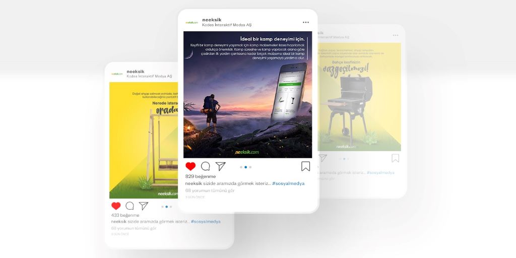
How to Create Eye-Catching Visual Content for Brands: The Ultimate Guide to Stopping the Scroll
In a world where the average person scrolls through 300 feet of content daily, your brand’s visuals have less than three seconds to make an impression. Yet, most businesses churn out generic images, overused templates, and forgettable graphics that blend into the noise. The result? Wasted ad spend, low engagement, and a brand that fails to stand out in a crowded market.
I’ve spent over a decade crafting visual content for brands—from scrappy startups to Fortune 500 companies—and the difference between those that thrive and those that fade into obscurity comes down to one thing: intentionality. Eye-catching visual content for brands isn’t about following trends or using expensive tools. It’s about understanding your audience, leveraging design psychology, and creating visuals that tell a story in an instant.
This guide isn’t about making pretty pictures. It’s about crafting visuals that stop the scroll, communicate your brand’s essence, and drive action. You’ll learn how to develop a cohesive visual identity, use color and composition to evoke emotion, and create content that converts—whether you’re a solopreneur or a marketing team of 50.
The Psychology of Visual Content: Why Some Brands Stand Out and Others Don’t
The Three-Second Rule: How the Brain Processes Visuals
The human brain processes images 60,000 times faster than text. But here’s the catch: It also filters out 99% of what it sees as irrelevant. To cut through the clutter, your visuals must trigger an emotional response within three seconds. This is where branding design tips like contrast, color, and composition come into play.
A 2023 study by MIT found that the brain prioritizes images with:
- High contrast (light vs. dark).
- Faces or human elements.
- Movement or implied action.
Example: Nike’s ads often feature athletes mid-motion, with stark contrasts and bold colors that grab attention instantly.
The Role of Color in Brand Recognition and Emotion
Color increases brand recognition by up to 80%, according to a University of Loyola study. But it’s not just about aesthetics—colors evoke emotions and influence behavior. For example:
- Red: Urgency, passion (used by brands like Coca-Cola and Netflix).
- Blue: Trust, security (used by Facebook and IBM).
- Green: Health, tranquility (used by Whole Foods and Starbucks).
Pro tip: Choose a color palette that aligns with your brand’s personality and stick to it. Consistency builds recognition.
The Power of Composition: How Layout Guides the Eye
Great visuals don’t just catch the eye—they guide it. The rule of thirds, leading lines, and negative space are tools to direct attention where you want it. A well-composed image feels balanced and intentional, while a poorly composed one feels chaotic or boring.
Example: Apple’s product photos use negative space and symmetry to draw focus to the product, making it feel premium and desirable.
The Storytelling Factor: Why the Best Visuals Tell a Story
People remember stories, not stats. The most effective visual content for brands doesn’t just show a product—it shows the product in action, solving a problem, or transforming a life. Think of GoPro’s ads, which don’t just show cameras but the thrilling adventures they capture.
How to Create Eye-Catching Visual Content for Brands: A Step-by-Step Guide
Step 1: Define Your Brand’s Visual Identity
Before creating content, clarify your brand’s visual identity. Ask:
- What emotions do we want to evoke?
- What colors, fonts, and styles align with our personality?
- How do we want to be perceived (e.g., luxurious, playful, trustworthy)?
Example: Glossier’s visual identity is soft, feminine, and minimalist—reflecting its “skin first, makeup second” ethos.
Step 2: Know Your Audience Inside and Out
Visuals that resonate with one audience may fall flat with another. Research your target demographic’s preferences:
- Age: Younger audiences prefer bold, trendy visuals; older audiences may respond to classic, clean designs.
- Interests: A fitness brand might use high-energy action shots, while a meditation app would opt for calming, serene images.
- Platforms: Instagram favors high-contrast, vibrant images; LinkedIn performs better with professional, polished visuals.
Pro tip: Create audience personas to guide your visual content strategy.
Step 3: Invest in High-Quality Imagery
Blurry, pixelated, or poorly lit images scream “amateur.” Use:
- Professional photography: Hire a photographer or use high-quality stock images (e.g., Unsplash, Shutterstock).
- Custom illustrations: Unique illustrations set your brand apart.
- User-generated content (UGC): Encourage customers to share photos of your product in action.
Example: Airbnb’s Instagram feed is a mix of professional shots and UGC, creating an authentic yet polished look.
Step 4: Master the Art of Typography
Fonts communicate as much as images. Choose typefaces that align with your brand’s personality:
- Serif fonts (e.g., Times New Roman): Traditional, authoritative.
- Sans-serif fonts (e.g., Helvetica): Modern, clean.
- Script fonts: Elegant, feminine (use sparingly).
Pro tip: Stick to 2-3 fonts max for consistency. Use hierarchy (headlines, subheadings, body text) to guide the reader’s eye.
Step 5: Use Contrast to Grab Attention
Contrast makes your visuals pop. Experiment with:
- Color contrast: Bright colors against neutral backgrounds.
- Size contrast: Large headlines with small body text.
- Texture contrast: Smooth fonts on rough backgrounds (or vice versa).
Example: Spotify’s ads often use bold, clashing colors to stand out in busy feeds.
Step 6: Leverage the Power of Video and Motion
Static images are great, but video and motion graphics capture attention even more effectively. A Wyzowl study found that 84% of consumers are convinced to buy after watching a brand’s video. Use:
- Short-form videos (e.g., TikTok, Reels) for engagement.
- Explainer videos to simplify complex ideas.
- Behind-the-scenes clips to humanize your brand.
Pro tip: Add captions to videos—85% of Facebook videos are watched without sound.
Step 7: Create Templates for Consistency
Templates save time and ensure your visuals stay on-brand. Use tools like Canva, Adobe Spark, or Creative Cloud to design reusable templates for:
- Social media posts.
- Blog headers.
- Email graphics.
- Presentations.
Example: Coca-Cola’s red-and-white color scheme and classic font are instantly recognizable, even in simple templates.
Step 8: Test and Iterate Based on Performance
Not every visual will resonate. Use analytics to track engagement and adjust your strategy. Pay attention to:
- Click-through rates (for ads or emails).
- Likes, shares, and comments (for social media).
- Time spent on page (for blog visuals).
Pro tip: A/B test different visuals to see what performs best with your audience.
Branding Design Tips: How to Make Your Visuals Unforgettable
Tip 1: Develop a Signature Style
A signature style makes your brand instantly recognizable. This could be:
- A specific color palette (e.g., Tiffany Blue).
- A unique illustration style (e.g., Mailchimp’s quirky doodles).
- A consistent filter or editing style (e.g., VSCO’s moody tones).
Example: Red Bull’s high-energy, action-packed visuals align perfectly with its “gives you wings” branding.
Tip 2: Use Real People in Your Visuals
Stock photos of models in perfect poses feel inauthentic. Instead, use:
- Real customers (with permission).
- Team members (to humanize your brand).
- Diverse representations (to appeal to a broader audience).
Pro tip: Candid shots often perform better than staged ones.
Tip 3: Incorporate Brand Elements Subtly
Your logo doesn’t need to dominate every visual. Instead, weave brand elements into your content subtly:
- Use your brand colors in graphics.
- Add a small logo watermark to photos.
- Use consistent fonts and styles.
Example: Nike’s swoosh often appears as a small, unobtrusive element in its visuals.
Tip 4: Play With Perspectives and Angles
Unique angles make your visuals stand out. Try:
- Bird’s-eye view: Great for flat lays or product shots.
- Low angle: Makes subjects look powerful or dramatic.
- Close-ups: Highlight details and textures.
Tip 5: Use Data Visualization for Complex Ideas
Infographics, charts, and diagrams simplify complex information. Tools like Venngage or Piktochart make it easy to create professional data visuals.
Example: A saas company might use an infographic to explain its product’s features in a digestible way.
Tip 6: Keep It Simple
Cluttered visuals confuse and overwhelm. Stick to one focal point per image and use negative space to let it breathe.
Tip 7: Stay on Trend (But Don’t Sacrifice Your Brand)
Trends can boost engagement, but don’t let them overshadow your brand’s identity. For example, if minimalism is your brand’s style, don’t jump on the maximalist trend just because it’s popular.
Creative Visuals: Real-Life Examples of Brands That Nailed It
Case Study 1: Glossier’s Minimalist Aesthetic
Glossier’s visual content is soft, minimalist, and feminine—reflecting its “skin first, makeup second” philosophy. The brand uses:
- Neutral color palettes (pinks, beiges, whites).
- Natural lighting for a fresh, clean look.
- User-generated content to build authenticity.
Result: A cult-like following and a $1.2 billion valuation.
Case Study 2: Airbnb’s Storytelling Approach
Airbnb’s visuals focus on experiences, not just listings. They use:
- High-quality photography of unique stays.
- Diverse, relatable models to appeal to a global audience.
- Before-and-after shots to highlight transformations.
Result: A brand that feels aspirational yet accessible.
Case Study 3: Dollar Shave Club’s Humor and Simplicity
Dollar Shave Club’s visuals are fun, irreverent, and simple. They use:
- Bold, bright colors to grab attention.
- Humor and memes to engage their audience.
- Minimalist product shots to highlight value.
Result: A viral brand that disrupted the shaving industry.
Common Mistakes That Ruin Visual Content for Brands
1. Inconsistent Branding
Using different colors, fonts, or styles across platforms dilutes your brand’s identity. Stick to a style guide.
2. Overcomplicating Designs
Too many elements compete for attention. Keep it simple and focused.
3. Ignoring Mobile Optimization
Over 60% of web traffic comes from mobile. Ensure your visuals look great on small screens.
4. Using Low-Quality Images
Blurry or pixelated images make your brand look unprofessional. Invest in high-resolution assets.
5. Forgetting About Accessibility
Use alt text for images, high-contrast colors, and readable fonts to ensure your visuals are inclusive.
6. Copying Competitors
Inspiration is fine, but copying makes your brand look generic. Develop a unique visual identity.
7. Neglecting to Test Visuals
Always preview your visuals on different devices and platforms to ensure they display correctly.
Expert Insights: How to Elevate Your Brand’s Visual Content
Insight 1: Use the Rule of Thirds for Better Composition
The rule of thirds divides your image into a 3×3 grid. Place key elements along the lines or at their intersections for a more engaging composition.
Insight 2: Leverage User-Generated Content
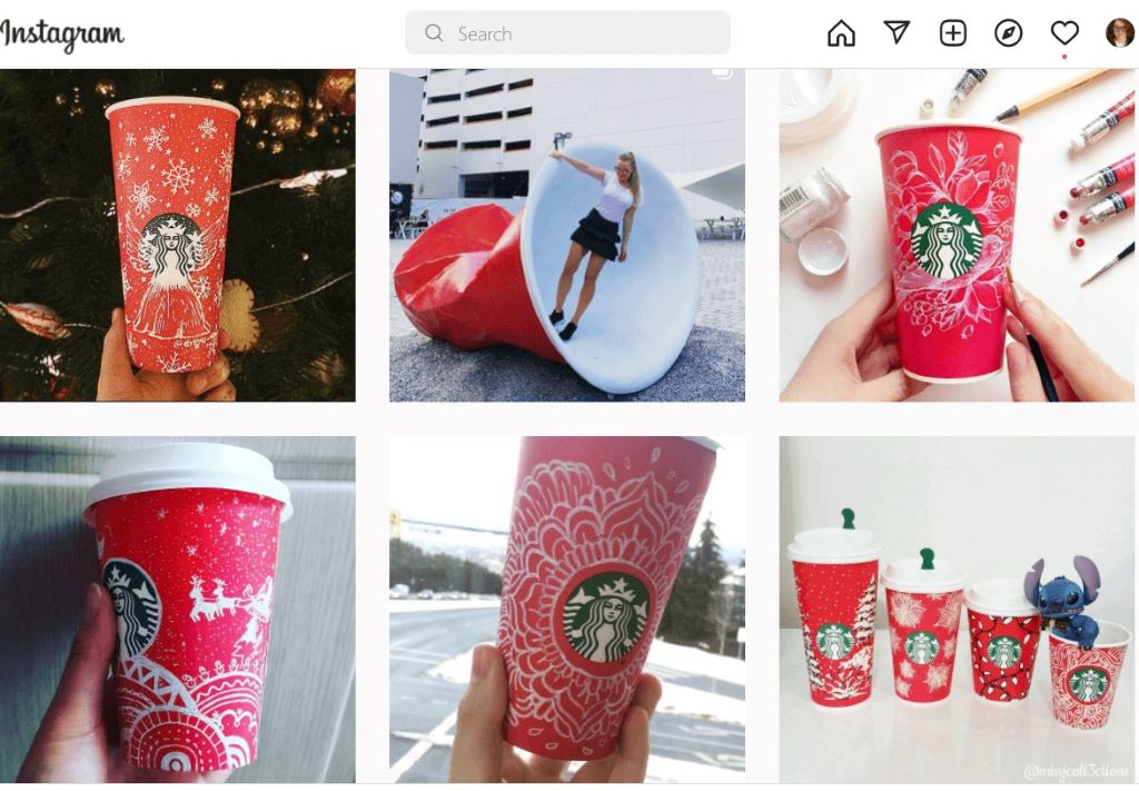
UGC builds trust and saves you time. Encourage customers to share photos of your product with a branded hashtag.
Example: GoPro’s entire Instagram feed is built on UGC, showcasing real customers’ adventures.
Insight 3: Create a Visual Content Calendar
Plan your visuals in advance to ensure consistency and alignment with campaigns or holidays. Use tools like Trello or Asana to organize your calendar.
Insight 4: Use Animation to Capture Attention
Static images are great, but subtle animations (e.g., GIFs, cinemagraphs) can boost engagement. Tools like Adobe Photoshop or Canva make it easy to create simple animations.
Insight 5: Repurpose Content Across Platforms
Turn one piece of content into multiple formats. For example:
- A blog post becomes an infographic, a carousel post, and a video script.
- A product photo becomes a social media post, an ad visual, and a website banner.
Insight 6: Collaborate With Designers or Agencies
If design isn’t your strength, hire a professional. Platforms like 99designs, Fiverr, or Upwork connect you with talented freelancers.
Insight 7: Stay Inspired but Stay True to Your Brand
Follow design blogs, Pinterest boards, or Instagram accounts for inspiration, but always filter trends through your brand’s lens.
Related Topics:
- How to Create Memphis Graphic Design Style Compositions
- How to Create Stunning Graphics for Social Media: A Step-by-Step Guide for 2026
FAQs: Your Top Questions About Creating Visual Content for Brands
1. How do I create visual content if I’m not a designer?
Use user-friendly tools like Canva, Adobe Spark, or PicMonkey. Many offer templates and drag-and-drop features for non-designers.
2. What’s the best way to source high-quality images?
Use stock photo sites like Unsplash, Shutterstock, or Pexels. For authenticity, hire a photographer or use UGC.
3. How often should I update my brand’s visual content?
Refresh your visuals every 3-6 months to keep your brand feeling current. Update more frequently for seasonal campaigns.
4. What are the most important elements of a visual content strategy?
- Consistency in branding (colors, fonts, styles).
- High-quality, relevant imagery.
- A clear message or call-to-action.
- Optimization for each platform (e.g., square images for Instagram, horizontal for blogs).
5. How can I make my visuals more engaging on social media?
- Use bright, high-contrast colors.
- Include faces or human elements.
- Add text overlays for key messages.
- Post videos or GIFs to stop the scroll.
6. What’s the best way to measure the success of my visual content?
Track metrics like:
- Engagement rates (likes, shares, comments).
- Click-through rates (for ads or links).
- Conversion rates (e.g., sales or sign-ups).
- Time spent on page (for blog visuals).
7. How do I keep my visual content fresh and relevant?
- Stay updated on design trends (but don’t sacrifice your brand’s identity).
- Experiment with new formats (e.g., Reels, Stories, interactive content).
- Regularly audit your content to remove outdated or underperforming visuals.
Conclusion: Turn Your Brand Into a Visual Powerhouse
Creating eye-catching visual content for brands isn’t about having the biggest budget or the fanciest tools. It’s about understanding your audience, staying true to your brand’s identity, and using design principles to communicate your message effectively. By focusing on consistency, quality, and storytelling, you’ll create visuals that not only stop the scroll but also build trust, recognition, and loyalty.
Remember: Every visual is an opportunity to connect with your audience. Whether it’s a social media post, a blog header, or a product photo, make it count.
Your next step? Audit your brand’s current visuals. Pick one element—whether it’s your color palette, typography, or imagery style—and refine it using the tips in this guide. Small, intentional changes lead to big results.
Ready to Elevate Your Brand’s Visuals?
Start by creating a mood board for your brand’s visual identity. Use Pinterest, Canva, or even a simple Google Doc to collect images, colors, and fonts that inspire you.
Sorry, the comment form is closed at this time.