
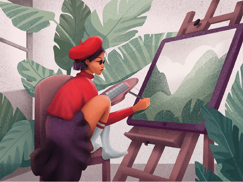
12 tips to improve the graphic design of your blog or web
Today, the Graphic Design of a Web and Usability are key points in a digital strategy; Sales or other goals of your business can be affected if you neglect them.
What image do you want users of your brand to have? How do you want to be remembered? Follow these 12 tips to improve the design and usability of your website and increase conversion.
Reflect On Your Brand Image
Perhaps it has been the same for many years and may not work well in a digital environment. Keep in mind the possibility of commissioning a restyling of the logo, that is, hire a designer who adapts your brand image to the requirements of the Internet.
Adapt Your Logo And Brand Image To All Media
Avoid using the same image in all digital formats… they never look quite right! You can create them yourself or ask a designer to generate different graphic pieces for profile photos on Networks, headers of your Web, Banners, Newsletters, etc.
On pages like Canva and Piktochart, you can design graphic elements for your brand without the need for technical knowledge.
Be Careful With Colors
Like fonts, they must be applied without abuse. Try to choose the main color, a secondary color, and at most a third color. Use them wisely, as they serve to communicate and highlight elements of your Site. Use them in buttons of Subscription Forms, to add products to the cart, etc.
Create A Graphic Identity Manual For Your Blog
Decide what style of images you are going to use in the headers of each post (photos, vectors, illustrations, etc.), as well as the graphic pieces and icons that will be inserted in each entry. Define a palette to alternate the color of the main image of each article, trying not to resemble each other too much.
Aim for the entire Site to have visual coherence, so that readers can identify an article on your Blog simply by looking at its header.
Do Not Download Images From Google To Use Them On Your Website
Consider purchasing images from sites like Dollar Photo Club or even free image banks like Pixabay. Or better yet, hire a photographer who takes good shots of your premises and your team and uses them in all online media to humanize the company’s image and increase the trust of users and potential customers. Investing in your own photography really does make a difference!
Develop Actions In Which Your Brand Image Is The Center Of Everything
For example, call a contest among your users to design a poster for an event you organize or even a restyling of the logo. This will increase the presence of your brand image in the collective imagination of your user community. To do this, you must provide them with your logo and graphic elements in vector format or in high resolution.
Analyze How Your Logo Looks On Different Mobile Platforms
Create one specific to each device. For example, if it includes small text, it may be difficult to read in mobile formats. In that case, it would be good to have a simplified and iconic version for small and medium devices.
Use Visual Metaphors
Insert elements that reinforce the concept throughout your website, as they provide brand presence and make it remain stronger in the user’s memory. For example, if you have a candy sales site, you could place buttons that resemble the shape of candy or background boxes for text similar to candy paper.
But do not abuse! Be subtle, add details without overloading: virtue is in balance.
Use Trendy Graphic Elements
In this way, you will ensure that your website shows an image consistent with the latest trends. You could use Material Design style images, blank buttons, horizontal stripes with large text, etc. And from time to time, review the ‘look’ of your Site and try to always look modern and current.
Avoid Images That Are Too Big Or Too Small
In this way, you will prevent your Site from being too heavy or from being pixelated. Use them in the exact size you consider taking into account the wide variety of screens on the market, and there are users who may not be viewing your website correctly if you do not adapt the images to the width of their devices.
Analyze The Behavior Of Your Website
Worry about knowing how your Site behaves on the main devices and try to correct all the imbalances that you find. There are online applications like ScreenFly that allow you to see how your website looks on all kinds of devices and models.
Insert Call-To-Action Elements
Make them stand out from the rest by using stripes with colored backgrounds, large buttons, hover effects, etc.
In Conclusion…
Analyzing is fundamental in the design of a Web page. The users will be the ones who give you the clues about what you should change, always listen to them and try again and again!
You may also be interested in 13 Graphic Design Tricks for Non-Designers
Sorry, the comment form is closed at this time.