
The Corporate Flyer: Our Advice To Make It Better!
Offline advertising continues to be the most effective method of promoting your company in the area. In short, although we are in the era of web marketing, smartphones and digital, guerrilla and viral marketing, the flyers remain without a doubt the evergreen of advertising, as they easily manage to reach a large number of customers in front of a ridiculous expense. After all, if this were not so, why would many international brands continue to use them?
Clearly, a flyer does not automatically guarantee the success of an advertising campaign; there are some precautions that must be taken into consideration when creating your own corporate flyer. Let’s see them together …
Identify the target audience
Identifying the audience you want to reach with your flyer is an operation that is very often taken aback. On the contrary, it is of utmost importance to understand what your target audience is because it allows you to set up a practically ad hoc flyer. What are the problems you can solve for him? So why do they have to choose you? Having a clear target allows you to create ad hoc offers and to insert online promotions. The target is also the one around which the choice of graphics revolves: form and content will obviously have to be different if it is aimed at a young audience or at older people.
Study a simple but attractive layout
The layout, the graphic sector, and the color palette are, as we have already mentioned, a choice consequent to the identification of the target.
When studying the layout of the flyer, you must first decide on its size and shape. These should also be chosen in relation to the type of distribution you choose: for example, if you decide to deliver the flyers by hand, in transit areas, or at specialized fairs, it is advisable to design small flyers that the public can put in pocket or bag. In this sense, the most common formats are generally the A5 (148 × 210 mm), the A6 (105 × 148 mm), and the A7 (74 × 105 mm), or their respective elongated variants A5L, A6L, and A7L. Conversely, if you opt for a house-to-house flyer, the format may be larger, such as an A4 (210 × 301 mm).
An excellent idea is to focus on singular shapes, such as rounds, ovals, stars, door hangers, or bookmarks. These particular forms are excellent for attracting the attention of the public and being immediately noticed in contexts in which to be flashy even before knowing the content is without a doubt a winning move.
The next step is to determine the actual graphic characteristics of the flyer, i.e. the visual elements that will be fundamental to attract the gaze of the recipients: bright colors, simple but high contrast shapes and unconventional images will be the focus on which to focus. The keyword is simplicity: a flyer must be readable and understandable immediately; otherwise, it is not effective. For the same principle, the texts contained within your flyer must also be carefully selected and arranged to guarantee the maximum intelligibility possible, highlighting the most important contents in a graphic way.
A good method to accurately dose the space is to use a grid layout, usually very fashionable in web design and graphic design, or it may be interesting to develop a short infographic, ideal for conveying information in a more fluid and understandable way for the public.
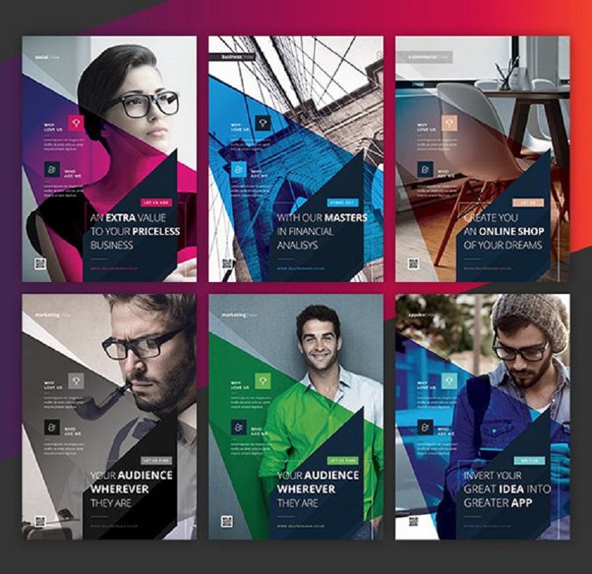
Choose high-quality images and photos
This is a point of fundamental importance in the realization of the flyer. High-quality images and photographs denote greater attention to detail and consequently greater seriousness and greater professionalism. In particular, the corporate flyer must promote your company and therefore contain images that enhance it properly. In case you have to rely on stock images, make sure not to use ugly images from the commercial watermark.
Sorry, the comment form is closed at this time.